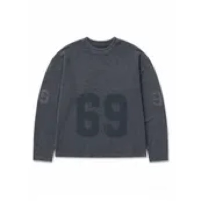
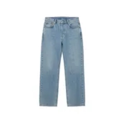
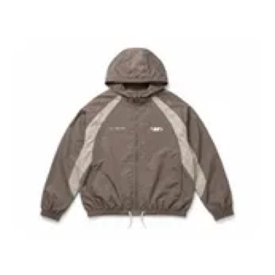
Plus
AI Generated
Selling Fast!79 Sold
Sponsored
Brand Name
Product name product name product name
£0.00£2.99-30%
+5


 (9)

Everything that merged, shipped or opened — newest first. Every row links to the project page with its options and decision.
Two layers: primitives named by what they are, semantic tokens named by role. Components consume only semantic tokens; the brand mode swaps what they resolve to. Brand values are the Colour Alignment set (post-KM review, Aug 26).
live — switch brand in the sidebarsurface/actionsurface/action-hoversurface/action-pressedtext/on-actionsurface/accentbrand/light-1brand/light-3 · surface/accent-subtlesurface/pagetext/link · border/focusmode-invariant unless markedBody text floor is Grey 5. Grey 4 and below never carry body text — they fail AA contrast.
#0F0F0F#6B6B6B · floor#B5B5B5#FFFFFF#D33F3F#1F7A25#7A5800#FAFAFA#FFF + border#0F0F0F#000 @ 60%#E7E7E7#FFF2F2#EAF6EA#FFFBE6#E7E7E7 · dividers#D6D6D6#767676#0F0F0F#767676 · grey 4 okshared by every fascia#FFFFFF#FAFAFA#F2F2F2#E7E7E7#D6D6D6#B5B5B5#767676#6B6B6B · text floor#323232#0F0F0F#000000never colour alone — always paired with icon or text#D33F3F#FFF2F2#FFD600#FFFBE6#70C474#EAF6EAlocked · names preserved from the DS file#E6FFFC#D6FFF9#E8F4F2#B8FDF4#9DEDE2#7BE7D8#76DECF#70BEB3#529C92#00787D#00565A#1E6F6312 slots · same structure every fascia#FFE9F0#FEE0EA#F1DCE3#FCD3E1#FBC7D8#F8B5CC#EEA5BE#EA92B0#DD789B#BB305F#A82A55#CB4870boohooMAN, PLT and Karen Millen carry their colour-alignment CTA set (rendered above when switched); their remaining primitive slots land as each fascia is audited. Removed from the primitive layer: KM mode overrides (re-mapped fresh via semantic layer) and Rewards colours (project dead).
One role set, every fascia. Sizes are identical across brands — only font family and weight change with the mode. Fixed per-breakpoint sizes (no fluid clamp for v1), line-height mirrors Figma AUTO, letter-spacing defaults to 0.
display-lg · 48Wardrobe iconsheading-xl · 28New season editheading-sm · 16Delivery & returnsbody-md · 14Free returns within 28 days. Star buys are final sale — check the label before you commit.caption · 12Selected lines only. T&Cs apply.mobile / desktop px · same for every fasciadisplay-lg32 / 48 · strongHero, marketing pagesdisplay-md28 / 40 · strongSection openersdisplay-sm24 / 32 · strongEditorial leadsheading-xl20 / 28 · strongPage titlesheading-lg18 / 24 · strongSection titlesheading-md16 / 20 · strongSubsection titlesheading-sm16 / 16 · strongCard titles — matches existing "Header 1"heading-xs14 / 14 · strongInline section labels — matches "Header 2"body-lg16 / 16 · regularLong-form bodybody-md14 / 14 · regularDefault body — matches "Body M"body-md-strong14 / 14 · strongEmphasisbody-sm12 / 12 · regularCompact bodycaption12 / 12 · regularCaptions, T&Cs, legalmicro10 / 10 · regularSmallest legal labels10 · 12 · 14 · 16 · 20 · 24 · 28 · 32 · 36 · 40 · 48
colour alignment, Aug 26debenhamsGeologica300 Light600 SemiBoldsentenceboohooMontserrat500 Medium700 BoldsentenceboohoomanMontserrat500 Medium700 BoldsentencepltRoboto400 Regular700 BoldUPPERCASEkarenmillenJost400 Regular600 SemiBoldsentenceEvery brand font is a Google Font with the full weight range available. Fonts for the other 11 fascias are captured as each is audited. If a fascia's font ever demands a size shift, it becomes a brand-mode override at the role layer — the default is consistency.
We measure spacing in gaps. 1 gap = 4px, so gap N = N × 4px. It is the same unit as Tailwind's spacing scale (1 = 0.25rem = 4px at a 16px root), so gap N is Tailwind N: gap 4 = 16px = p-4 / gap-4 / m-4. Every spacing value is quoted in both: gap 4 (16px).
gap · px · Tailwind · tokengap 0.52pxp-0.5 · gap-0.5 · m-0.5--gap-0_5Hairline nudges — rating stars, countdown under its textgap 14pxp-1 · gap-1 · m-1--gap-1Tight inline gaps — icon + label · USP bar top/bottomgap 1.56pxp-1.5 · gap-1.5 · m-1.5--gap-1_5Desktop USP bar top/bottomgap 28pxp-2 · gap-2 · m-2--gap-2Tight component padding · card actions inset · promo field gapgap 312pxp-3 · gap-3 · m-3--gap-3Standard inline gapgap 416pxp-4 · gap-4 · m-4--gap-4Default component padding · mobile page margingap 520pxp-5 · gap-5 · m-5--gap-5Modal padding · medium paddinggap 624pxp-6 · gap-6 · m-6--gap-6Default desktop margin (small) · section separationgap 832pxp-8 · gap-8 · m-8--gap-8Section breaksgap 1040pxp-10 · gap-10 · m-10--gap-10Large section spacinggap 1248pxp-12 · gap-12 · m-12--gap-12Layout-level spacinggap 1664pxp-16 · gap-16 · m-16--gap-16Hero / page-level spacinggap 2080pxp-20 · gap-20 · m-20--gap-20Page-level spacinggap 2496pxp-24 · gap-24 · m-24--gap-24Desktop side gutter at 1440+ — content scales insidegap 32128pxp-32 · gap-32 · m-32--gap-32Largest layout spacingassets/ds/tailwind.preset.jsAdd the preset to the front end's config — presets:[require('./assets/ds/tailwind.preset.js')] — and load tokens.css. It maps every DS step to its --gap-* token, so p-4 resolves to var(--gap-4) (16px). It extends Tailwind rather than replacing it, so existing classes keep compiling.
Off the DS scale in today's front-end build (from the dev Storybook's compiled CSS): 2.5 (10px) · 3.5 (14px) · 7 (28px) · 9 (36px) · 11 (44px) · 14 (56px). They still work; each should move to the nearest DS step when that component is next touched.
Writing it down: designs, specs, the catalogue and Storybook quote spacing as gap N (Npx). Sizes (a 50px field, a 24px icon) and type (12/15) stay in px — they aren't spacing.
All icons draw at a 1pt stroke. Buttons use 16 / 20 / 24; 32 and 48 are for hero and decorative use.
layer scalez-base / z-raised0 / 10Page flow, raised cardsz-dropdown / z-sticky100 / 200Menus, sticky headersz-banner / z-overlay300 / 400Banners, scrimsz-modal / z-popover500 / 600Dialogs, popoversz-toast / z-tooltip700 / 800Toasts, tooltips — always on topdeferred — deliberateThe live estate applies breakpoints inconsistently per component; the new system exists partly to fix that. Designers work at 390 and 1440. Components are specced fluid-first; the named breakpoint set gets locked once the component audit reveals real reflow needs.
4pt corners by default. Square is a brand-mode option, not a fork — PLT and The Brand Room opt in today; any fascia can, by swapping one token mapping.
radius/defaultradius-4radius-0radius/lgradius-8radius-0radius/pillradius-fullradius-0current brand resolves radius/default →
Everything draws at 1pt — borders, dividers, line icons. 2pt is reserved for focus rings and selected states. No shadow scale: the system is flat, hierarchy comes from borders and surface tones.
border-width/default1ptBorders, dividers, iconsborder-width/emphasis2ptSelected statesborder-width/focus2ptFocus ringsborder/subtle#E7E7E7Default divider · PDP box bordersborder/default#D6D6D6Inputs, cardsborder/strong#767676Emphasised bordersborder/action · border/focusborder/error#D33F3FError input bordersBorders aren't subject to text contrast rules, so every grey is available — the Grey 5 floor applies to text only.
Conservative by default. Three durations, two curves, and a global collapse to instant under prefers-reduced-motion — built into the token layer, no per-component work.
motion-duration-fast100msMicro — button pressmotion-duration-base200msDefault — hover, fade, modal openmotion-duration-slow300msLarger transitions — drawer slidemotion-easing-standardcubic-bezier(.2, 0, 0, 1)Defaultmotion-easing-emphasisedcubic-bezier(.3, 0, .8, .15)Attention-pullingDeliberately flat. If a future component genuinely needs elevation (a floating popover, say), an elevation token gets proposed then — not pre-emptively.
Every component targets WCAG 2.1 AA. Non-negotiable: anything that doesn't meet the bar doesn't ship, and a component spec without an Accessibility section isn't finished.
contrast · body4.5 : 1Floor is Grey 5 #6B6B6B — Grey 4 and below never carry body textcontrast · large/UI3 : 118pt+ text and UI componentsfocusalways visible2pt ring in the brand action colour · full keyboard operationtouch targets44 × 44Minimum on mobile — inline body links exempt where naturalmotionreduced-motionAll animation collapses to instant · nothing auto-plays without opt-outmeaningnever colour aloneStatus pairs colour with icon and text · icon-only buttons carry aria-labelThe Grey 5 floor applies to text only. Borders, dividers, icons and decorative elements may use any grey — Grey 2 is the typical divider, Grey 4 the standard secondary icon.
Brand sites install two packages: the tokens and the components. Set one attribute on the root element and every semantic token resolves to that fascia.
semantic tokens onlycomponents never touch primitivesBrand colours appear only in the token layer — this is what keeps multi-brand workingone mechanismdata-brand attributeNo per-brand CSS files, no component forksdocs page = specthey ship togetherA component without a docs page doesn't existComponents are intentionally constrained. If one genuinely doesn't fit, the source is visible on its page — copy and modify, or raise a request to extend the official component.
The library index. Brand chips show themed coverage; status is live in production or in build.
Four states, one component, every fascia. Switch the demo brand in the top bar — colour, type, radius and case all follow the tokens.
ButtonPropsvariantprimary · secondary · tertiaryOne primary per view · default primarysizesm · md · lgDefault md · sm needs touch-target reviewdisabledbooleanPrevents interactionloadingbooleanPrevents interaction · sets aria-busy · spinnerbrandinherited from modeNever set per-instanceSecondary carries the CTA colour as a keyline, never a second fill. PLT renders square with uppercase labels; every other fascia 4px radius, sentence case — that difference is brand config, not a component fork.
keyboardnativeRenders a native button element — focusable and operable by defaultfocus ring2ptborder/focus — brand action colour, 2px offsetloadingaria-busyBoth disabled and loading prevent interactiontouch target44 × 44Met at md and above · sm under review for mobileafter the Figma node auditFull variant set (Pill, Icon Only, Roundel, Navigation, Payment, Dropdown, Quantity Selector, App Store badges) · icon slot handling (boolean + size, not encoded as states) · loading visuals · pressed-vs-hover naming unification · disabled colour reconciliation (golden truth label #767676 vs token text/disabled Grey 3) · focus ring exact width and offset per size.
packages/react/src/components/button · Figma: DS file → BUTTONS (new) · 9144-1807
The hero asset — built exactly from the Figma component, used across every PLP and carousel. Every optional element is a variable layer: turn it on per fascia, never fork the card.
(9)Formats: standard, and .pc--compact — the shorter PLT / Brand Room format (caps brand 11px, 12px name, tighter gaps) that the alignment rolls out to every fascia. Wishlist variants: heart-in-circle (Debenhams, boohoo, Warehouse today) · bookmark-in-square (boohooMAN, KM, Brand Room) · plain heart (PLT). Image corners are square — matching live and Figma.
booleans on one component — the Figma model, kept verbatimwishlistButton32px circle · heartIcon swaps per fascia: heart or bookmark (KM, boohooMAN, Brand Room, Warehouse) — nested atomic iconquickAddicon · button · noneCircle icon (Debenhams) or full-width Add button (boohooMAN)productTagbadge, bottom-leftPlus / Petite / Tall — see C-07 Badges for stackingtaggstarsocial-proof barGrey 1 chip, no icon · PLP "Selling Fast! 79 Sold" · PDP two-line card with close · bag linesponsoredtext rowFigma uses Grey 4 — lifted to Grey 5 here for the AA text floorcolourSwatches20px swatch rowSwatch shape is a nested atomic component — restyle per brand without touching the cardshowReviewStarsstars + count12px stars, 2px gapshowBrandbrand lineHidden on PLT + Warehouse per the Sep briefImage 2:3 on surface/media · card gap 12 · info gap 8 · title gap 4 · text 14px — brand w-strong, name w-regular 2-line clamp, was-price w-mid strikethrough · sale price + percent in status red · actions 32px circles, top 8 right 8, gap 8.
assets/ds/components.css → .pc · Figma: DS file → Product Card · 5992-10841 · variable layers on · 12999-146812
The combined pattern from the A/B/C tests: desktop gets a dropdown row with sort on the right; mobile gets Next Day Delivery + a single Sort & Filter entry opening a full sheet with drill-in panels and a pinned CTA.
Desktop is a strip under the category links: optional NDD toggle, dropdown boxes, "Show more filters", sort right. Mobile (live platform) is the split Filters | Relevance bar; mobile (new format) is the floating pill row — white radius-42 chips with soft shadow, NDD toggle inline, chips open the combined sheet (Brand Room Figma 739-92223).
assets/ds/components.css → .sf · Figma: Sort & Filter combined · 1783-11572 — A/B/C variants live in the same file for the test readout.
Image-overlay tags (Plus, Petite, Sale, Sponsored) and the AI-generated banner. Badges stack bottom-left, newest on top; the AI banner is a full-width strip pinned to the image foot and is mandatory whenever the imagery is AI-generated.
ai bannermandatoryFull-width black strip at image foot whenever product imagery is AI-generated — uppercase, 10px, whitestackingbottom-left columnBadges lift 32px when the AI banner is present (.has-ai) · gap 4themingtokens onlyRadius, font, case follow the brand mode — square on PLT/Brand Room automaticallyassets/ds/components.css → .badge · Figma: AI watermark + stacking · 25-11775 · live demo: ai-generated-badge
The canonical icon set, pulled from the DS Figma Iconography page. Rules: 1pt stroke everywhere regardless of scale, aspect ratio always locked (render in a fixed square box, object-fit contain — never stretch), default colour icon/primary. PLT runs its own lighter 16px set for header and card chrome.
136 icons
360
apple
authenticity
duplicate
geolocate
ar
arrow-increase
boohooman-premier
bookmark
plane
48hr-refund
account
account-balance
account-overview
acorn
add
add-photo
addresses
ai
alert
app
assembly
bag
birthday
calendar
camera
card
cash-back
celebrate
checkout
clear
close
collapse
compensation
completion-time
contact-prefs
copy
country-settings
cover
cross-circle
cruelty-free
delete
delivery
delivery-fast
delivery-insurance
down
down-arrow
dress
edit
email
expand
expand-filled
filter
flame
foundation-finder
gift
gift-card
grid
hairadvisor
hamburger-menu
hanger
hide
image
info
leaf
left
light-bulb
link
linked-account
location
lock
lock-fill
makeup-advisor
measure
android-menu
minus
mirror
more
notification
offers
order
paraben
pause
placeholder
play-control
play-thumb
plt-royalty
price-promise
promo-code
question
quick-add
replay
resale
return
return-to-payment
right
right-arrow
room
save
search
settings
share
share-android
show
sign-out
size
skinadvisor
spinner
staff-area
star-fill
star-half
star-outline
subscribe-and-save
suggested-search
support
tick
tick-circle-fill
tick-circle-outline
tile
time
trophy
university
unlimited
unlimited-infinity
unlimited-plus
up
upload
vegan
visually-similar
wishlist
xmas
xmas-tree
palette
quantity
shop
zoom
facebook
instagram
pintrest
tik-tok
x
you-tubeFigma aIHmkCaTy9c5EWOxAGw0So · node 669-2707 (Payment Icons). Raster exports at 3x in assets/ds/icons/pay/, shown at 30px tall in the footer band (C-08) in live order. iDEAL-Wero and Tink exist in Figma but aren't used on boohooMAN.

visa
mastercard
amex
maestro
visa-electron
apple-pay
payplus
paypal
klarna
clearpay
google-pay202 · 24 × 17Figma aIHmkCaTy9c5EWOxAGw0So · node 5353-2781 (Country Flags, component set Flags). Flat SVGs in assets/ds/icons/flags/, one per country, named by slug (united-kingdom.svg). Globe and EU first, then A–Z. Square, country-selector and PLT header variants in the same frame are built from these.

Globe
European Union
Afghanistan
Albania
Algeria
Andorra
Angola
Antigua and Barbuda
Argentina
Armenia
Aruba
Australia
Austria
Azerbaijan
Bahamas
Bahrain
Bangladesh
Barbados
Belarus
Belgium
Belize
Benin
Bhutan
Bolivia
Bosnia and Herzegovina
Botswana
Bouvet Island
Brazil
Brunei
Bulgaria
Burkina Faso
Burundi
Cambodia
Cameroon
Canada
Cape Verde
Central African Republic
Chad
Chile
China
Colombia
Comoros
Congo
Costa Rica
Croatia
Cuba
Curacao
Cyprus
Czechia
DR Congo
Denmark
Djibouti
Dominica
Dominican Republic
Ecuador
Egypt
El Salvador
Equatorial Guinea
Eritrea
Estonia
Eswatini
Ethiopia
Fiji
Finland
France
Gabon
Gambia
Georgia
Germany
Ghana
Greece
Grenada
Guatemala
Guinea
Guinea-Bissau
Guyana
Haiti
Holy See
Honduras
Hong Kong
Hungary
Iceland
India
Indonesia
Iran
Iraq
Ireland
Israel
Italy
Ivory Coast
Jamaica
Japan
Jordan
Kazakhstan
Kenya
Kiribati
Kuwait
Kyrgyzstan
Laos
Latvia
Lebanon
Lesotho
Liberia
Libya
Liechtenstein
Lithuania
Luxembourg
Madagascar
Malawi
Malaysia
Maldives
Mali
Malta
Marshall Islands
Mauritania
Mauritius
Mexico
Micronesia
Moldova
Monaco
Mongolia
Montenegro
Morocco
Mozambique
Myanmar
Namibia
Nauru
Nepal
Netherlands
New Zealand
Nicaragua
Niger
Nigeria
North Korea
North Macedonia
Norway
Oman
Pakistan
Palau
Palestine
Panama
Papua New Guinea
Paraguay
Peru
Philippines
Poland
Portugal
Qatar
Romania
Russia
Rwanda
Saint Lucia
Saint Vincent and the Grenadines
Samoa
San Marino
Sao Tome and Principe
Saudi Arabia
Senegal
Serbia
Seychelles
Sierra Leone
Singapore
Sint Maarten
Slovakia
Slovenia
Solomon Islands
Somalia
South Africa
South Korea
South Sudan
Spain
Sri Lanka
Sudan
Suriname
Sweden
Switzerland
Syria
Tajikistan
Tanzania
Thailand
Timor-Leste
Togo
Tonga
Trinidad and Tobago
Tunisia
Turkey
Turkmenistan
Tuvalu
Uganda
Ukraine
United Arab Emirates
United Kingdom
United States
Uruguay
Uzbekistan
Vanuatu
Venezuela
Vietnam
Virgin Islands
Yemen
Zambia
Zimbabweaspect lockedalwaysFixed square box + object-fit contain — a squished icon is a bug1pt strokeall scalesDrawn at 1pt on the 24 grid; don't scale below 16px (stroke thins) — flagged: source stroke-based SVGs for true non-scaling 1ptsizes16 · 20 · 24UI chrome 24 · card chrome 16 · PLT set 16 with 12px glyphsmulti-part10 flaggedzoom, cross-circle, support, resale + 6 more export as layered vectors — re-export flat when neededassets/ds/icons/lib/ · Figma: Iconography · 470-887
Every component harvested from the estate on 08 Sep 2026 — ten repos read end to end (.context/18-component-inventory.md). Colour truth is the colour-alignment set; slot architecture follows Group-Design-System. Switch fascia with the brand button to see each skin. Nothing below carries a hardcoded brand colour.
.bdFive types from the golden matrix (Buy It Now is off on every fascia for now): primary, secondary (white + brand outline), tertiary (Neutral fill, 40px), tertiary XS, text only. States: pressed, disabled (grey on every brand for tertiary), spinner — per Figma 12533:14818 the label gives way to a 24px arc and the fill drops to Neutral. Sizes .sm 6/12 · .md 8/16. Icon slot 20px (.ic24 / .ic16). .pay is the fixed-navy checkout Pay CTA, 8px radius.
.payScheme colours are fixed and never brand tokens (DS 9144-1931): PayPal #FFC439 (KM runs PayPal on #EEEEEE via --paypal), Apple Pay black, Google Pay white with #3C4043 border, Klarna #0B051D, Clearpay #B2FCE4. .pay--mini 114px, .pay--glass 25px radius + blur for floating chrome. Artwork is the frame's own exports in assets/ds/icons/payments/.
Floating-label field (default / focus / filled / error — label shrinks 14→12 and the input grows in), select driven by a real native <select>, 24px checkbox filled with --icon-action, 26px radio, toggle, 28px quantity stepper (minus becomes remove at 1), promo field + 95px Apply, and the PSP static field set — fixed navy / #EFEFF1 / 8px radius on every fascia, because the payment provider renders it.
Banner: 4px status bar + 20px icon + text, optional inline action and dismiss; success / neutral (never dismissible — it's a readout) / error. Toast: bottom black snackbar (1.8s) or top light actionable (6s, "View"). Stock alert and empty state round it out.
Your bag is empty
Price block (now / was / save badge — PLT's is transparent with #C90000 / promo line / OOS label), size selector 60×50 with three OOS treatments (greyed, strike, notify bell), 60×89 colour image swatches with the black-plus-white-keyline selection, accordion, section header + rail, USP box (DS 3619-10541), BNPL (DS 2969-10048), free-delivery threshold (BBz64OeCbe5TBmYKbCxvCp), Deliver+ banner and bag module skinned per fascia (SEEL 2026), at-a-glance list.


One sheet shell: scrim 40%, white panel with 4px top radius to 100% − 56px on mobile, a centred 480px card from 768px; .sheet--auto hugs content (Added to bag), .sheet--dark is the VTO gradient variant with a 12px radius and safe-area padding. .modal is the centred card that scales in from 0.96. Bag line item is the 99×148 grid; order summary sits on Grey 05.
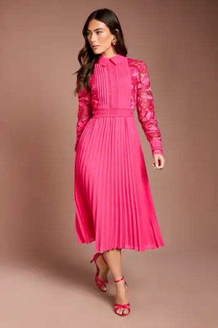
Balance card fills per fascia (--card-bg: Debenhams aqua gradient, boohoo/MAN black, PLT garnet, KM orange), 62.5px numeral with tight tracking, loyalty label in caps (Royalty / Unlimited / Premier). Rows are white panels on --page-bg with a 24px icon, status text and an 8px status dot.
From the AI-generated-badge proposal (EU AI Act Article 50(4), live 02.08.26; ASA covers the UK). The strip is live text, never a rasterised layer (screen readers, the 10px legal floor, localisation, badge shifting); it owns the bottom edge of the image at every size; every other badge shifts up by exactly --ai-h; wishlist and quick add stay top-right; Sponsored stays below the image except in PLP grid view where it becomes a badge and no other badge shows. Placement is driven by an image-level AI flag everywhere before add-to-bag; hidden in bag / mini bag / checkout — legal sign-off required. Alt text appends "AI generated image". See C-07 for the strip itself.
.tile-railassets/ds/components.css → EXTENDED LIBRARY · assets/ds/tokens.css → EXTENDED COMPONENT TOKENS · Inventory: .context/18-component-inventory.md (+ four full repo reads in .context/inventory/) · Backlog not yet ported: PDP gallery, Shop The Look + bundle family, notify-me form, VTO flow, Brand Room nav/drawer/hero family, checkout saved-card rows, glass nav chrome (app), request-form kit.
Every component in the system, live, in the brand you have selected. Open one for what it is, when to use it and how it is built. The same catalogue generates our Storybook for the dev team.
The front-end team's Storybook has 79 components across 178 stories, themed for 21 fascias. This is how it overlays with ours — component by component, token by token — and what the shared build should become.
React · Tailwind · per-fascia CSS variablesComponents are React with Tailwind utility classes. A variant prop selects a class string (Button has 19). Theming is a flat list of ~25–67 CSS variables per fascia — RGB triplets like --color-primary: 123 231 216 — read by utilities such as bg-primary, font-cta and rounded (which resolves --default-rounding: 0 on PLT and Brand Room — exactly our square modes). Greys are fixed utilities on the same Grey 1–6 ramp we use. Fonts per fascia match ours except Karen Millen (dev runs Work Sans for CTA and headings) and Warehouse (Roboto). A fascia toolbar global switches the theme; our Storybook exposes the same global mapped onto data-brand.
The plan: our catalogue is the visual target. Where a dev component matches, the dev build adopts our tokens and states; where it is partial, the Docs note says what to add on which side; where we have no counterpart it is a new component for us to spec; where they have no counterpart it is a new component for them to build from our story.
dev → oursdev theme variables → our semantic tokens.context/inventory/05-dev-storybook.md — the full ingest: every component with its props, per-fascia theme variables, 1440 + 390 renders of all 178 stories. DG Group Design System Storybook ↗ — generated from the same catalogue (storybook/).
What was added, changed and fixed in the design system in each iteration, newest first, and which project drove it. Projects build only from these components: a wrong one is fixed here and pushed back, a missing one is added here first.
The general rules every component is built from — colour, typography, spacing, radius, borders, motion, accessibility, and how to use the system. One page; jump with the chips.
Every project in the estate, one click away. Prototypes open in a new tab; the repo link is the record (brief, options, decisions).
briefs · options · chosen routesEvery brief as a record: what was explored, what won, and where it lives now. Delivered work merges to the master prototype.
Align boohoo, boohooMAN, PLT, Warehouse and The Brand Room onto one core PLP template. Differences become configuration, not forks. PLT is the reference implementation.
All five run PLT's exact card and grid; only tokens differ.
PLT base; brand label, was-price, badges and grid density per fascia.
B plus a compact / comfortable density switch per market.
from the briefimageFullWidthBHW · WarehouseMatch PLT full-width imageryfontScale → pltBHW · WarehouseSite-wide reduction to PLT sizescolumnsDesktop 5→4WarehouseMatch other brandsshowBrand → falseWarehouseLike PLTfavouriteIcon → kmWarehouseAdopt KM heartFinal styling per fascia across five core screens, plus the golden-truth button state matrix. The Colour page renders this project's output.
Side-by-side with live colour picker for review sessions.
Picker and Before states removed post-review; deep-linkable per brand.
Rejected — breaks the token model.
One smart field between donation and payment that accepts a promo code or a gift card number and works out which it's been given. Single self-contained prototype.
Every fascia in the group. Pick one for its own page: logo downloads in black or white as SVG or PNG, brand guidelines, colour and type. Opening a brand also previews it across the system.
 Debenhams Group
 Debenhams
 boohoo
 boohooMAN
 PrettyLittleThing
 Karen Millen
 Warehouse
 The Brand Room
 Debenhams Outlet
 Wallis
 Burton
 Principles
 Coast
 Oasis
 Dorothy Perkins
 Misspap
 DSGN Studio
 Training Dept
data-brand — the only theming mechanismOne attribute on the root element themes everything: colours, font, weights, radius, case. No per-brand CSS files, no component forks. All 17 fascias are modes today.
debenhamsGeologicaColour set from the colour-alignment prototype (Aug 26)boohooMontserratColour set from the colour-alignment prototype (Aug 26)boohoomanMontserratColour set from the colour-alignment prototype (Aug 26)pltRobotoColour set from the colour-alignment prototype (Aug 26)karenmillenJostColour set from the colour-alignment prototype (Aug 26)warehouseHelvetica NeueColour set from the colour-alignment prototype (Aug 26)brandroomArchivoColour set from the colour-alignment prototype (Aug 26)debenhamsoutletGeologicaNo aqua: black buttons + outlines like boohoo (12 Oct)wallisUrbanistColour set mapped from the front-end theme (primary / CTA / nav / footer band)burtonMontserratType + buttons = boohoo / MAN (Jake, 12 Oct)principlesLatoColour set mapped from the front-end theme (primary / CTA / nav / footer band)coastRobotoColour set mapped from the front-end theme (primary / CTA / nav / footer band)oasisGeologicaColour set mapped from the front-end theme (primary / CTA / nav / footer band)dorothyperkinsPublicSansColour set mapped from the front-end theme (primary / CTA / nav / footer band)misspapMontserratboohoo / MAN in #101820, grey secondary outline, inverted header (12 Oct)dsgnstudioHanken GroteskColour set mapped from the front-end theme (primary / CTA / nav / footer band)trainingdeptHanken GroteskBlack like boohoo, DSGN Studio font, black logo bar (12 Oct)